
Before responsive web design (RWD) became a
new best practice, there were two basic types of website designs:
- Static design gives components of your website fixed dimensions.
- Fluid design gives components of your website percentage dimensions. This means that your browser adjusts to changes in your window size.
Responsive designs are similar to fluid in
that they are adaptive to screen size, but are even more adaptive. The code
involves CSS media queries, which basically say “if the screen size is less
than this, then set the dimensions to this.”
 |
| Source: Web Designer Wall |
There has been a lot of buzz about
responsive design as of late, and the reason it’s been brought to the forefront
is because of the increasing multi-device habits of consumers. Advertisers and
content publishers alike have been playing a game of catch me if you can
with their audience across their smartphones, smart TVs, tablets, and desktop
computers.
One challenge that many content publishers
faced was the incompatability issues of their desktop website on mobile
devices. The response to that was to create mobile websites (eg.
m.bbcworldnews.com). There were many problems with this, however:
- Double the Work: m-dot websites mean you have to maintain two separate sites. Every page on your website has to have an equivalent on the m-dot site.
- SEO Disruption: m-dot websites spread out your SEO efforts. In order to rank your site, Google crawls the web to look for inbound links and relevant content to give you a quality score. If you’re on two separate sites, these two sites are competing against each other for your ranking.
- Sharing is Hard: when m-dot sites are shared and opened on a desktop browser, the content is shrunken down since the site has been designed for a 4.7-inch screen.
- Screen Sizes Differ: Not every mobile device screen is the same size. Screen sizes differ within mobile devices (eg. iPhone vs. Samsung Galaxy) and between them (eg. iPhone vs. iPad)
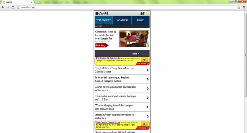 |
| M-Dot site on a desktop browser |
The solution to the m-dot problem is
responsive web design (RWD). RWD means you have one website that users can
access from any device. As Ethan Marcotte, the web designer credited for paving
the RWD road, put it:
“Rather than tailoring disconnected designs to each of an ever-increasing number of web devices, we can treat [the devices] as facets of the same experience.”
 |
| Source: Web Designer Wall |
Stay tuned for Part 2, where I discuss the
pros and cons of RWD and what it means for marketers and content creators.
